A digital facelift for the payment industry3 min read
In the world of branding, it’s common for an iconic brand to be updated. In fact, it’s expected, especially when you’re an institution that’s generations old. Arguably, you can say that other brands follow suit when someone in their space rebrands, after all, competition does bring on change.
And you would be right. Because this is exactly what’s happening in the payment world, brands like Mastercard and American Express have rebranded.
As brand nerds, these changes peaked our interest and this article was born.
So what do you say?
Let’s explore what they did and why we think they did it.
First, the redesigns.
Take a look at the MasterCard Rebrand:
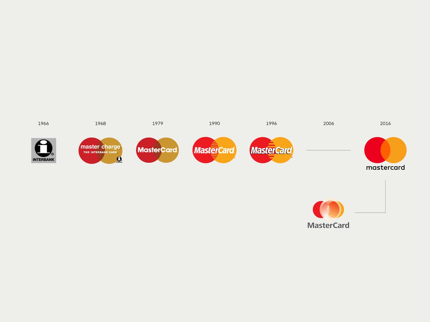
Image courtesy of Pentagram
Look at where they’ve come from, the iconic logo, that grew up in the 60’s, the era of MadMen, came into existence during a time when branding and advertising were on the forefront of companies minds, it looks like it has returned to its roots.
A few of the changes: Colors which appear bright and glowing to the eye, the overlap and intersection point, and a custom typeface that is digitally friendly, dropping the name down from the mark and having it underneath it, making the name of the logo all lowercase, making the name black instead of white or grey.
You can view the full case study here on Pentagram’s website.
Take a look at American Express:
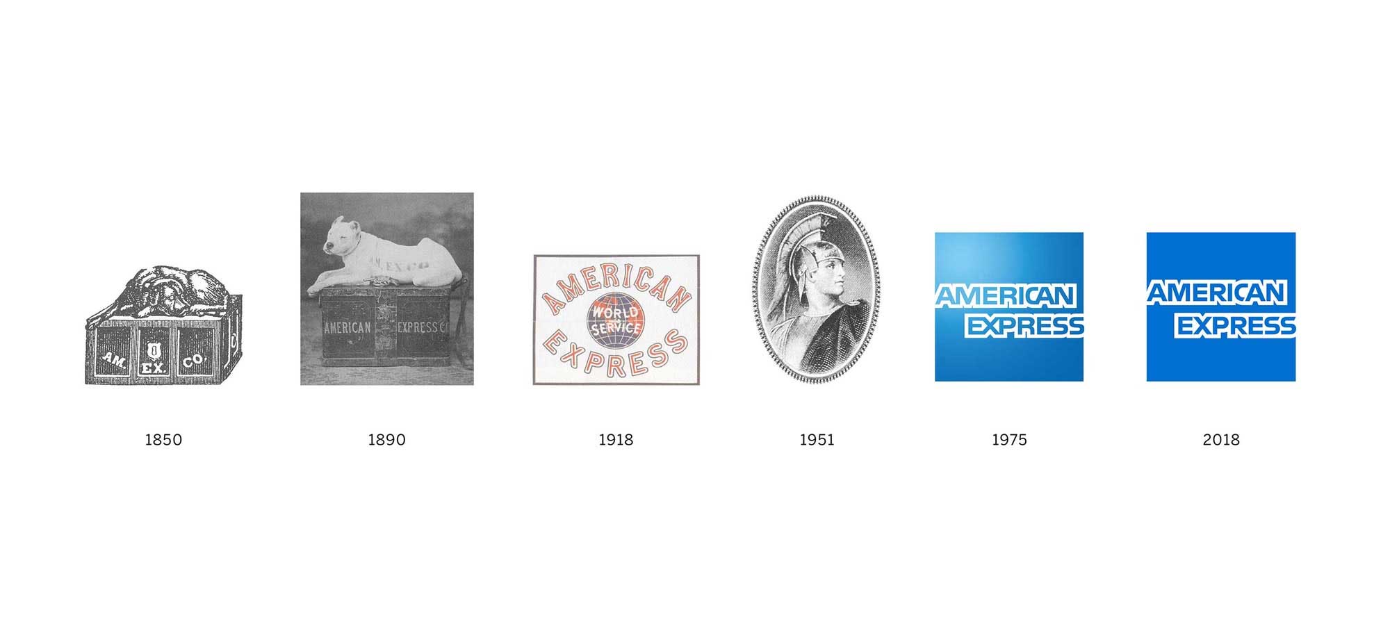
Image courtesy of Pentagram
The new American Express logo, a company that’s been around since 1850 was born in a much different era than its counterpart, Mastercard. But much like its friend it has gone through a series of changes, personally, we love the “dog on a box” logo and are considering something similar for Amplitude Media.
The changes: A custom typeface (font), sharper lines color gradient, smaller marks for smaller places.
You can view the full case study here on Pentagram’s website.
The theme? a more digital-friendly brand.
With both redesigns, the goal is to make brands more digitally friendly and provide the ability to scale, whether their mark is on a billboard, social media profile, or on a smartwatch, these brand needs to be consistent and concise.
In today’s digital age, brands need to be versatile. The places they exist have changed and grown, you wouldn’t be thinking about designing a logo for a smartwatch in the 60’s, because of this designers and brand architects are thinking about things like favicons (the webpage browser logo) and where a brand may be placed in the future.
We’d like to finish with this, now more than ever the emphasis on a great digital and brand experience is paramount to customer conversion and user success.
Which raises the question, is your brand digitally friendly? Click the link below, fill in the form, and recieve a free brand audit.
Free Brand Audit